The Science of CTA Placement: Why Middle and Right-Aligned Buttons Drive More Conversions
CTA button placement plays a decisive role in how users interact with digital experiences. More than a visual choice, the position of a call-to-action influences attention, engagement and conversion rates across websites, emails and campaigns. Understanding where users naturally look, scan and act reveals why centre and right-aligned CTAs consistently outperform left-aligned alternatives.
Every design decision carries weight—none more so than the placement of your call-to-action (CTA) buttons. While this might appear to be a choice based on aesthetics, the position of your CTA determines user engagement and can significantly affect conversion rates. Should you position it on the left, in the centre or on the right of the screen? This decision draws on behavioural psychology, eye-tracking studies, mobile user experience research and tried-and-tested design patterns. Discover why middle and right-aligned CTA buttons consistently outperform left-aligned ones, and understand what this means for your websites, emails and campaigns.
Understanding Web Scanning Patterns
F-Pattern and Z-Pattern Explained
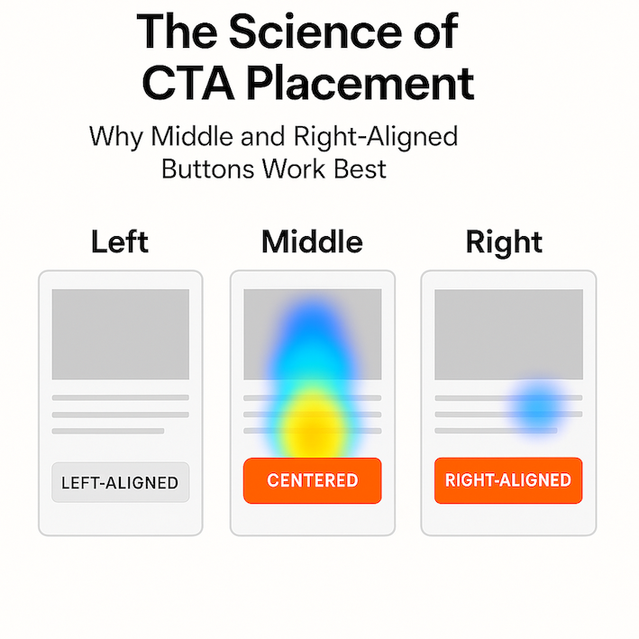
People rarely read entire web pages word by word. Eye-tracking studies, especially those conducted by the Nielsen Norman Group, show that users favour scanning over reading. Two dominant scanning patterns have emerged: The F-pattern, seen on text-heavy pages, and the Z-pattern, typical for less cluttered pages like landing screens or emails. Both these patterns see eyes ending their journey towards the middle or right edges of the page. These endpoints represent crucial moments in the user’s decision-making journey.
Positioning for Maximum Visibility
If you align your CTA where scanning naturally finishes, you put it exactly where users are most responsive. Centre or right-aligned CTAs capitalise on where the eye lands next, ensuring that the final prompt to act coincides with the user’s highest level of readiness. This reinforces the psychological closure that people seek before making a decision. The right and centre positions feel natural for summing up an experience, which increases the odds that users will convert.
Cognitive Load and Readiness to Act
The Journey to Conversion
Visitors rarely arrive ready to buy, subscribe, or take action immediately. Instead, their path features several steps: Seeking context, understanding value, building trust and then deciding on the next action. A left-aligned CTA interrupts this journey too soon, asking users for commitment before they have processed the essential details. Conversely, placing the CTA in the centre or to the right, after delivering the message, allows the information to resonate and increases willingness to click.
The Role of Hick’s Law in CTA Placement
Hick’s Law describes how decision-making takes longer as choices become more complicated. A well-placed CTA reduces cognitive drag by appearing right after persuasive content, at a logical destination. When the call to action coincides with natural scanning and mental readiness, friction drops and conversion rates increase.
Design Patterns and Learned User Behaviour
Action Buttons and User Expectations
Most people have internalised design norms from frequent digital experiences. Think about the last web form, checkout process or mobile app you used. The “Next,” “Submit,” or “Buy Now” button almost always appears on the right or at the centre of the screen. Over time these consistent placements have trained users where to look for actions that progress their journey or close a transaction.
How Breaking Patterns Hinders Conversion
Primary buttons placed on the right or centre follow well-established logic. Major design systems, such as those from Microsoft and Google, use these placements. Ecommerce sites put “Add to Cart” in these spots for a reason: Users have grown to expect it. When this expectation is broken by placing a CTA on the left, even a minor hesitation can cause distraction and undermine conversions.
Mobile Experience and Thumb-Friendly Design
The Shift to Mobile-First Thinking
As mobile traffic overtakes desktop use, the case for centre and right-aligned CTAs becomes stronger. On smartphones, the centre of the screen is naturally easier to reach, whether users are right or left-handed. Floating action buttons at the bottom right or centre further support this ergonomic need. This approach ensures that the primary actions remain within the thumb’s comfort zone, increasing the likelihood of a tap rather than an abandoned interaction.
Consistency Across Devices
Maintaining design consistency across desktops, tablets and mobiles reduces confusion. Responsive layouts that keep CTAs at the centre or right make user journeys more predictable. Users can act without hunting for prompts, leading to seamless transitions and successful outcomes.
A/B Testing and Conversion Data
Data From Real-World Experiments
CRO agencies repeatedly find that right-aligned and centre-aligned buttons outperform their left-aligned counterparts. A/B testing on forms, newsletters and product sign-ups shows a consistent trend towards higher completion rates when CTAs appear at the end of the typical visual path. Tools that track cursor heatmaps and eye movements, such as Hotjar and Crazy Egg, reinforce these results by revealing that engagement peaks at the middle and right sections when users contemplate taking action.
Understanding What the Numbers Mean
These quantitative findings reveal that effective CTA placement taps into subconscious browsing behaviours. When users find a CTA exactly where they expect it, they need not pause or search, reducing the chances of hesitation and drop-off.
The Exception: When Left-Aligned CTAs Can Work
Special Cases in Form and Interface Design
There are specific situations where left-aligned CTAs may serve a purpose. For example, in multi-step web forms, pairing a “Back” button on the left with a “Next” button on the right creates clear direction and a sense of control for users advancing through several stages. In applications designed for markets that use right-to-left languages, standard scanning behaviour ends on the left, making left-aligned CTAs more effective in those contexts.
What to Watch For in English-Language Designs
For Western audiences interacting with English-language environments, left-aligned CTAs typically break the user’s visual and cognitive rhythm. This can make actions appear disconnected from their related content and reduce the likelihood of user engagement.
Best practise CTA Placement by Use Case
Practical CTA Positioning Guidelines
Each digital channel presents its own positioning challenge and opportunity. Here are some leading recommendations:
- Website hero: Centre or right of the content — ensures high visibility after the headline and core value proposition.
- Landing page: Centre after each scroll section — presents the next step directly after users interact with key messages.
- Forms: Right-aligned below the final field — aligns with fast hand-eye movement, creating a natural flow to completion.
- Email marketing: Centre-aligned button — facilitates thumb-friendly taps and strong mobile performance.
- Pop-ups/modals: Right or centre for primary actions — matches the mental model of continuing or closing the interaction.
Why Adapting Matters
Choosing the best placement is about synchronising with established user pathways. Assess your specific context and choose a position that aligns action prompts with natural thought flow and physical comfort.
Behavioural Design and Next Steps
Design With Interaction in Mind
Selecting the right position for your CTA is not guesswork—this is the science of behavioural design in action. The evidence is clear: Centre and right placements resonate with how users scan, process messages and decide to click. When designing forms, landing pages or emails, think of every CTA as an opportunity to align visual cues, mental readiness and ergonomic comfort.
Optimising and Auditing Your CTA Strategy
Begin by reviewing your current CTA placements. Use tools and data to run A/B tests, observing shifts in performance as you test different alignments. For new campaigns or site launches, position CTAs in the middle or to the right, drawing from behavioural principles rather than habit or guesswork. This approach puts the weight of research behind your design decisions, allowing data and user expectations to guide improvements in engagement and conversions. The right placement transforms an everyday button into a powerful accelerator for business growth.